

Mobile phones have become an important part of our everyday life.
Er, life?
They even become integral part of our bodies!
Users nowadays use their smartphones for almost anything, ranging from searching information to buying and selling products and services.
Just to set the scene, let’s bring some serious numbers in the game.
– Users choose mobile devices 60% of the time rather than desktop or laptop devices to browse the internet.
– 40% of users are likely to move on to a competitor’s website if you fail to provide a good mobile experience to the user.
– 80% of Internet users own a smartphone.
– 71% of marketers firmly believe that mobile marketing is the next big thing for their business.
– Over 53% users abandon webpage if it takes more than 3 seconds to load.
– Mobile searches often lead to purchases. 70% of the time, users searching for products or services make a move within an hour.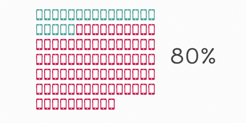
Developer’s Point of View
Among the leading UX designers to raise awareness on Mobile First approach, Jon Fox says that the next generation of users is upon us. “Their context is touch, mobility and speed. Reaching them requires intuitive design. For better or for worse, they are mobile first.”
The increased usage of mobile phones needs a fresh approach, one will cater to the increasing number of smartphones. To provide greater user experience and well developed applications, developers are now shifting towards creating mobile applications first and then modifying them for other platforms.
Development Approaches
There are two techniques for mobile web development: Graceful Degradation and Progressive Enhancement. Both offer their own unique advantages, with implementation dependent upon the judgment of developers.
Graceful Degradation
In graceful degradation, development is prioritized for desktop rather than mobile. After the website is completed, it is scaled down to suit mobile versions.
While it may cater well to desktop versions, the transition to mobile platforms often ends up in loss of content and removal of features which would otherwise be essential. This causes issues for mobile users since their access to content is limited, which negatively affects their user experience.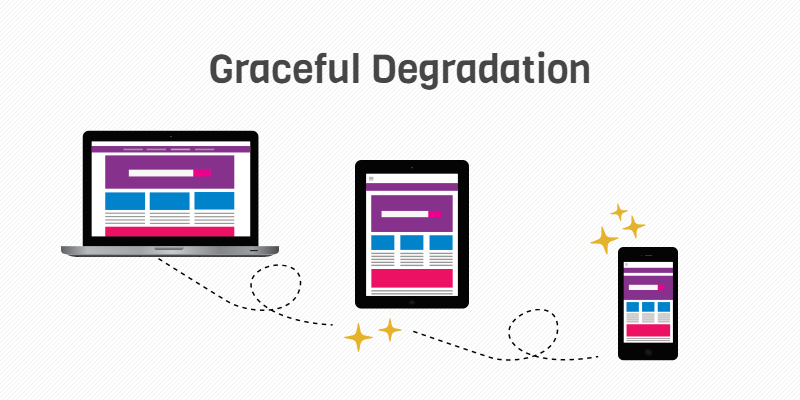
Progressive Enhancement
As a result of majority of users surfing the net using smartphones, a new approach is being implemented called progressive enhancement. Web page is built for mobile from the start , and after its completion, it is further developed to suit desktop and other platform variants.
Since most users use smartphones for web surfing, it is appropriate to create webpages keeping in mind that you should provide thebest possible user experience. Through progressive enhancement, a webpage can’t only be built to suit mobile standards but can be upgraded easily to suit other platforms as well.
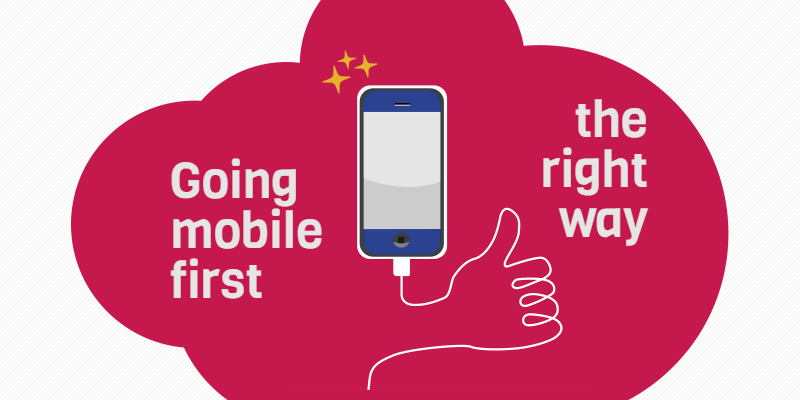
Going Mobile First the Right Way
Developing with a mobile first approach requires careful consideration of the following elements:
1. Make a list of the modules and individual features which will be a part of the mobile design. Arrange them accordingly, placing critical features under high priority and those of lesser functionality under lower priority.
2. Instead of developing the entire mobile UI in one go, develop separate features and then integrate them to create a larger module. This way, each part can be modified and chances of entire UI failing is very low. Moreover, the approach permits rapid development and is easy to implement.
3. Remember hardware and software constraints. Choose graphics which can easily be processed by mobile devices and design the UI while keeping in mind viewport size.
4. Dedicate a larger space for items which require touch, since fingers occupy more pixels as compared to cursors. Items such as drop down menus, buttons and links need to be modified to suit mobile UI.
5. Hover effects are unsuitable for mobile UI because no such feature has been created for finger touch.
6. Subject your application to testing on device during all phases of development. It yields actual results of behavior for the platform you are developing it for, which allows error identification and modifications.
 Limitations of Mobile First Designing
While mobile first designing offers significantly better user experience and functionality for mobile platforms, it does have its limitations.
– Hardware and Software constraints.
– Smaller viewport size, meaning lesser data can be shown at a time. Requires data to be modified to be displayed suitably.
– Greater technical skillset required.
– Processing power of device needs to be considered.
– Building mobile UI cuts out development of certain features, whose addition proves troublesome during later stages when migrating platform to other devices.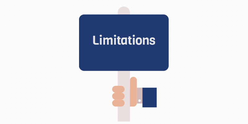
Google and Mobile First – What will Change?
Being the largest search engine on the internet, Google is arguably the deciding factor in many things, including mobile application and website rankings. With the recent news that it will develop a separate mobile first index, it is obvious that Google has recognized the significance of catering to mobile platforms separately.
Although both mobile and desktop webpages will be analyzed, having a mobile website isn’t all so necessary. Google will check both pages and compare the content on them. If there is less on mobile version, it will definitely affect its rankings. To counter this, mobile first and responsive web designing is the best option because it allows creation of a webpage for both platforms and also adapts well to all mobile versions.
With the changes on our doorstep, the following things need to be considered.
1. Accelerated Mobile Pages (AMPs) will also be considered similar to mobile pages and ranked accordingly.
2. Mobile optimized webpages will be ranked first, even if they are slightly outdated with regards to development technology.
3. The new algorithmswill display Search Engine Result Pages (SERPs) based on mobile page results. This means it will determine the rankings based primarily on mobile pages.
Future Proofing with Mobile First Development
While desktops and other platforms will remain indispensable, general purpose and web surfing has taken a turn for mobile platforms due to their portability and ease of use. With that in mind, development has shifted towards mobile and even Google has changed to accommodate these developments. With the number of mobile users growing daily and development progressing at a striking pace, it is only natural to assume that mobile first development has a bright future.

Asad has been working as a digital marketing executive for almost 7 years now. He is currently working as leading executive in GO-Gulf – a Dubai based custom website company where he is working on numerous projects for search engine optimization, conversion boosting and targeting relevant audience for the clients. You can reach him on Linkedin.

