Greetings, Reader.
It gives me great pleasure to introduce Kenneth Sytian to you today. Kenneth is the owner of Sytian Productions, a web design company in the Philippines. He has been designing websites and developing web apps for more than a decade. Kenneth is the owner and the driving force behind the company.
One popular means of using content to attract targeted leads is through gated content. Gated content has been widely used by large scale inbound marketing agencies like HubSpot, Marketo, Content Marketing Institute, and more. Creating free content for landing pages has been proven to improve the quality of leads, increase trust in your brand, and boost traffic across channels. Nowadays, free content is made available after signing up or filling up a form with your information.
This trend is called as gating content. Gated content is a popular way of getting qualified leads that can be easily turned into buyers once convinced to pursue the sales journey. Implementing a download gate filters out majority of your traffic from those who are truly interested in what you offer. The catch is, it’s up to you on how you can market your content better to attract qualified leads. The better you demonstrate the promise of value, the more will sign up to get your content. Some examples of gating content include account registration, social media sharing, paywalls, and many more.
Use download gates to learn and collect considerable and useful information about your prospects.
In this article, we will discuss proven techniques in increasing quality leads through gated content. We will talk about headings as an added call to action element, number of fields in a form, use of social proof, call to action buttons, and form aesthetics.
How to Increase Sign Up Form Conversion Rates
In increasing the conversion rate, you have to take care of several things on your landing page. Implementing these techniques on each landing pages will be hard, as there are different demands on each page.
Here are 5 tips to help you increase conversions rates for your landing pages:
1. Create the Form Heading as a Call to Action
Instead of leaving a typical contact form on the landing page, create a header for the form. It will help in catching the attention of the visitor, telling him what to do next after seeing what you can offer.
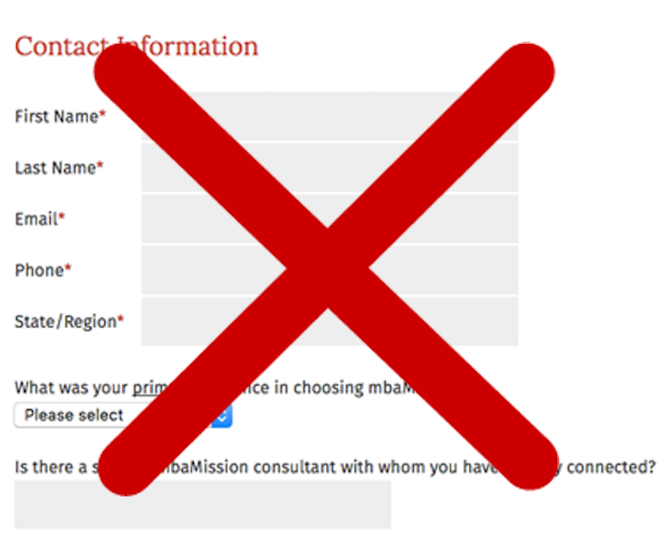
We can say that this contact form will convert the least amount of visitors in your website. The header Contact Information is passive. It does not encourage action, and it makes it look like a Contact Us page rather than a landing page for a Free Consultation.
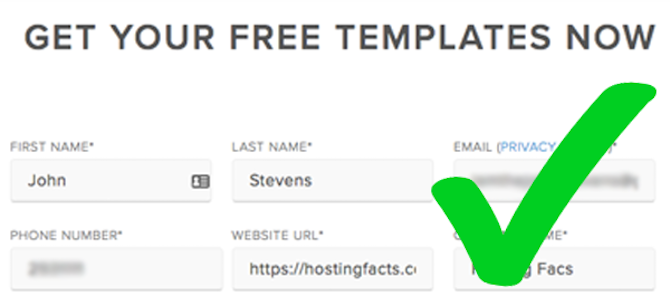
On the other hand, this form which can be found at HubSpot is cleaner, and more direct. Using an active verb like GET and creating a sense of urgency with the word NOW gives it a more personal touch. On the other hand, the concept of getting something for free and less the hassle makes this an enticing offer you can’t refuse. Downloading a template is easier than creating something from the ground up.
2. Quantity vs. Quality? Shorter or Longer?
That’s a long form from Clear Admit. It’s divided into several parts such as demographics, academic information, professional background, and application information. We can say that there may be some who would still push through with this long form, but the length of this form can significantly reduce conversions.
Most industry experts will suggest shorter forms for better conversions. As much as possible, limit your form fields up to five (5) fields maximum. Imagescape reduced their contact form from 11 to 4 fields, resulting to a 120% conversion increase.
However, there are times that long forms are necessary especially if you need information from your prospects. If you need to collect leads as much as you can, use shorter forms to invite them to sign up immediately. But, if you are looking to increase the quality of leads that you get from your forms, a longer form is more appropriate. (HubSpot, 2012)
3. Gather Social Proof for Sign Ups
This was taken from another HubSpot page. The tagline reads, “OVER 75,000 COMPANIES ARE ALREADY DESIGNING WITH THESE TEMPLATES TO SAVE TIME.”
Social proof is another technique you can use in driving leads to your gated content. It makes the offer more appealing because of the bandwagon effect. Fear of being left alone, fear of being left out from the majority disturbs us. The majority’s choice always influences our decision. Leveraging the power of social proof can help drive visitors into clicking that download button. Another way to successfully use the power of Social Proof to convert visitors into customers is to provide testimonials or reviews of your product.
Social proof creates trust to your brand, giving the users the feeling that you are an authorized source of information. Because of this trust, they will be compelled to download anything you say is a good guide to just about anything.
4. Write Converting Call to Action Phrases for your buttons
Attract your visitors to click that button with a persuasive call to action phrase! Call to action phrases should attract the attention of potential leads through different psychological triggers such as the sense of urgency, scarcity, or even the power of fear and free! Here are some examples of converting call to action phrases:
a. Schedule Your Free Consultation
b. Subscribe Now
c. Download Your Free eBook Now
d. Limited Seats Left!
e. Only 1 Slot Remaining!
A disclaimer ⎯ it pays to conduct tests before you get the optimal amount of conversion you’re looking for a better UI and UX on your landing page.
5. Form Aesthetics
Make sure that the negative space is well-balanced, the content is well-written, and the elements are not taking too much space and attention from each other. This helps the user focus on the elements within the page.
The negative space helps in focusing and bringing out the forms, driving the user to our desired action. Meanwhile, a well-written copy helps in convincing the user as you discuss the benefits that they can get from signing up to get your content.
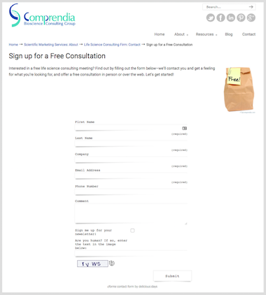
This is another sample landing page for a free consultation. You may notice that there’s too much white space in the form, and probably a poor choice of graphic for the page. The form guide texts are too small. They could have used the same font even on the form, and have it move farther up the page.
Here are our suggestions:
*Create a better copy for this consultation page. It doesn’t have to explain how the consultation works but at least give a highlight on what they can expect from your consultation.
*The use of the brown paper bag stock photo is irrelevant. Maximize the use of images through header images, or an image about life science. They could also use a more persuasive call to action header text on the website.
*Choose another contact form plugin. The typography used in this form doesn’t match the style in the website. Because of the actual size of the form, it has too much white space that could have been used for additional copy or a bigger contact form.
*Most studies validated that captcha decreases the incidence of conversions. One study, conducted by Animoto, resulted in the form without a Captcha step having a 64% conversion rate, while the Captcha form had only a 48% conversion rate: nearly one third more conversions!
*The deal with the negative space can also be dealt with if you update your web design style to modern styles and configure your CSS’s margin or width.
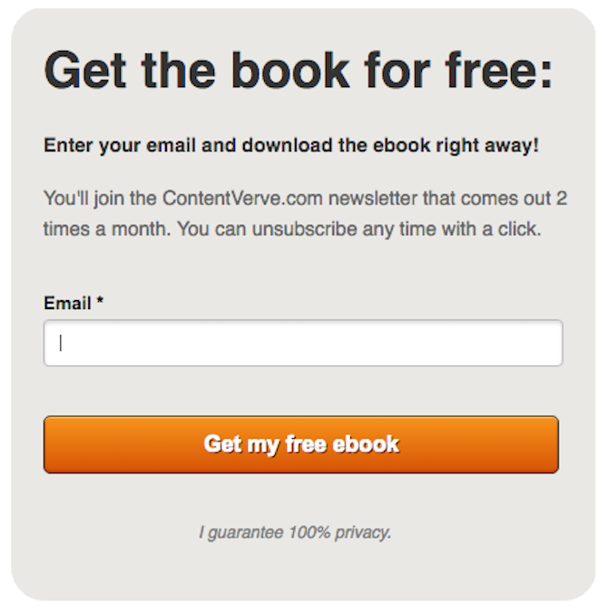
Last but not the least, indicate that you’ll value their information through a privacy policy. Because of security and identity theft issues happening around the globe, people need assurance that their information is kept safe. A simple notice that you do keep their information safe is enough for them to trust you with their data.
Conversion optimization, especially in landing pages with gated content, may take time to tweak and experiment on what works efficiently. Despite all these conversion tips to optimize your landing page, you should be able to deliver what you truly promise.
The big challenge is really up to you: are you prepared to provide content that is worth signing up for?
The author is highly qualified and writes blog posts weekly.


