Your pricing page can limit your sales. Even though you managed to drive visitors to your pricing page, that doesn’t mean that they will complete the purchase at any cost. After all, they are just one click away from disappearing for good.
Even though the pricing page is where most conversions happen, that doesn’t mean you shouldn’t pay attention to it.
A pricing page is a landing page, just like any other page, and if it’s not created to get visitors to take any action, it can destroy your conversion rate.
Luckily, there are some proven tactics that you should take into consideration when structuring your pricing page.
After going through hundreds of converting pricing pages, we have noticed some things they have in common, and we’re bringing them to you.
Avoid Having too Many Options
From our early childhood, we start believing that the more choices we have, the better. We want more toys, then more clothes, more subjects at school to choose from, more job offers. It is in our nature to be afraid of not having an option. Because an option means freedom. And there’s no greater feeling than the one of losing freedom.
However, it’s proven that having too many options stress us, and leave us less satisfied.
A lot of businesses want to cater to all of the groups, and thus offer a lot of pricing plans. Because they want everyone to find a plan that’s suitable for them.
So, the first thing to do when deciding on your pricing plans is to stick to 3 or 4 plans.
Most of the businesses have around 3 plans available, but some have even less than that.
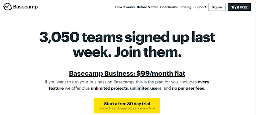
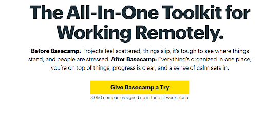
Basecamp has one pricing option that works for everyone. And their annual income is measured in millions of dollars.
Another example of a pricing page that has limited options is Sketch.
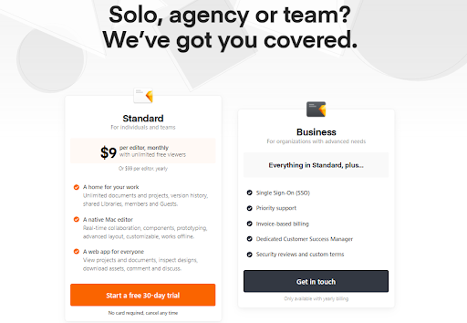
For a long time, they had only one option (the one you can see on the left), but they’ve recently added the business option as well.
As you might have heard, Sketch has been founded back in 2010, as a native Mac app. And ever since then, they have accumulated more than a million users.
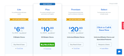
Even though having too many options becomes overwhelming, you don’t have to stick to only one or two options. There are tons of profitable companies out there that prefer having 3 or 4 options. FreshBooks, for example.
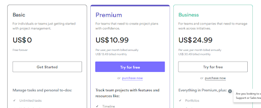
Give Special Attention to the Option in the Middle
Maybe you’ve noticed that many businesses mark the certain option as ‘the most popular’, ‘recommended’ and so. But what is the reason behind it?
It’s simple – by differentiating your most profitable option – you get more revenue.
Except for appreciating when showing them what to look for, people are more likely to choose an option that’s in the middle.
If you take a look at Asana’s page, you’ll quickly guess which of their options is the most popular (and the most profitable) one.
Use the Anchoring Effect to Make Your Pricing More Appealing
When making decisions, we tend to rely on the first piece of information we receive. In terms of price negotiations, if the first number we hear is low, anything higher than that number will sound extremely expensive, and the opposite.
This is a psychological principle that multiple scientists have covered during the last few decades. You can learn more about it in this article from Harward.
Even though a lot of people don’t know the specific name of this tactic, you probably have a chance to see the example of it at least twice a day.
Every time you see the discounted price, it’s the anchoring effect in action. How often have you decided to complete a purchase, because the old price seemed higher than the discounted one?
Besides announcing a sale, there are other ways of using this tactic on your pricing page.
Let’s take a look at the pricing page at Semrush.
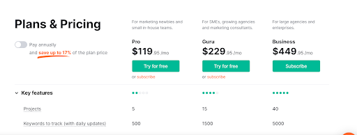
The lowest price is $119, but when you look at the price of $449…$119 doesn’t seem that much.
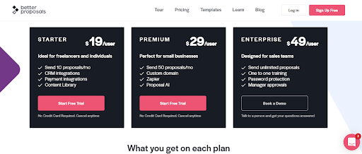
But take a look at the Better Proposal’s pricing page. When the plans start from $19, $49 seems quite high.
To conclude – the perception of your price highly depends on the numbers you compare it with. The higher the numbers around your most profitable option, the more attractive that offer appears.
Improve the Buttons on Your Pricing Page
The main issue with Call-To-Actions that we see on most of the pages is that they call for action only, but don’t call to value.
Subscribe, Start Today, Get Started…We can’t say that they don’t work…but the more specific you are, the more reasons your visitors will have to click on that button.
Here are some examples of buttons that people can’t resist clicking:

Add the FAQ to Your Pricing Page
Even though your visitors came to your pricing page, they still have doubts. It is in our nature to seek reassurance every time we need to make a decision.
In case that your visitors have unanswered questions, or they just want to make sure that they are making the right decision, the frequently asked questions will be there to address their doubts.
Add Testimonials
Most of the websites save their testimonials for the home pages only and don’t take the opportunity of sharing them elsewhere.
Testimonials are some of the most important content pieces that you can put on your website. They give the audience that final push they need to perform an action. They establish credibility and foster trust. So why not put in on the most important place on your website – your pricing page?
Extra tip: The content of testimonials should match the content of the page where they are used. If you have testimonials that speak about your pricing model, or the general satisfaction related to the pricing – they can’t find a better place than your pricing page.
A/B Test Everything
Even though adding these elements and following these practices has helped thousands of pricing pages convert better, what works for one audience, might not work for another.
For example, some websites have managed to increase conversions just by changing the CTA button from red to green, while others increased it by switching the green-colored button to a red one.
And this is something that you can’t guess.
If you want your pricing page to generate as much revenue as possible – always be testing.
There’s only One Thing you Don’t Need to Test Out
Even though we just said that you should not blindly stick to any of the practices before testing them, there’s still one thing that you should implement as soon as possible.
Your pricing page will have many elements. It has to be well designed, clean, appealing, and be able to keep all of those elements.
There’s no doubt – if your website is slow, and your pricing page is not loading fast enough, none of your previous efforts will count.
So make sure that your website is fast enough so that the visitor can load your pricing page in less than 2 seconds.
We’ve already covered all the ways speed affects your website, so feel free to check it out.
Conclusion
To sum it up – yes, your pricing page is your golden ticket to higher ROI, and it has the potential a lot of business owners forget to use.
You should be thinking of it just like any other website page. It should have a clear goal, and it should have an easy-to-follow structure.
Even though it may not seem that important to you, the details on your page can limit or increase your page.
We hope that you find this article helpful. If so, feel free to share it with your friends!