
Do you think brands like Ikea, McDonald’s, Chupa Chups, or Snapchat use yellow in their branding by accident?
Nope. Yellow is a happy color typically linked to optimism and warmth, and these companies want you to associate their brand with happiness.
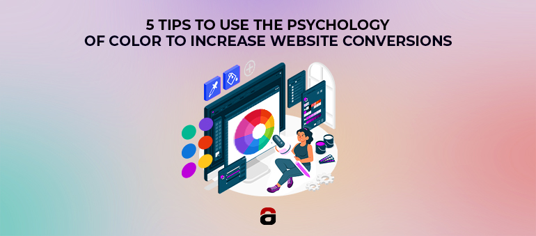
Colors are pretty powerful in marketing, and it’s no wonder they can affect how people perceive your website and the user experience on your pages.
In fact, you can even leverage the power of psychology of color to increase website conversions.
Want to know how? Here are five tips from experienced designers and marketers to help you out.
1. Rely on Real-World Logic to Avoid Confusing Your Audience
The first time we step outside on the streets, adults teach us that green means go and red means stop. In many public bathrooms, green means you can go in, and red means occupied.
That rule translates to almost everything else in life – look at your phone the next time it rings. The green button is for accepting the call, while you’ll use the red one to cancel it. If you switch colors, people will be unsure about where to click if they want to confirm, which may cost you a number of conversions – confused people don’t buy.
That’s why you should make sure you follow the everyday logic when choosing the colors for your website design, especially in the part where you require visitors to take action.
2. Test Until You Discover What Your Audience Prefers
Several A/B tests have shown so far that red performs better when used in the CTA button. Several companies tried green vs. red CTA buttons on their homepages, and the results might have been surprising for some: green may mean ‘go,’ but red outperformed it by 21% and 34%.
These findings, however, don’t mean you need to go and change your CTA button color right away. It means that, rather than being a hard and fast rule, you should test different colors and find what works for your audience.
Some audiences will prefer red; others will like green more. And some people feel motivated by a BOB! Don’t know what BOB is? It stands for Big Orange Button. Another experiment showed it could awaken the get-it-done enthusiastic spirit in people and increase your website conversions – even by 32.5% like in this WiderFunnel’s study.
Our color preferences depend on many factors: our sex, age, etc. Some studies have shown that as we get older, we start opting for softer and calmer colors more often, so it’s something to keep in mind if you have an “older” audience.
3. Use Contrast
Contrast is essential for good website design, and not just for the obvious reasons – you want specific parts of your landing or About us pages to stand out and call for action. It’s more than that: contrasting colors can help you balance the different values you want to communicate to your audience.
Let’s see an example.
Blue is a cold color, and many corporations have it in their visual identity as it signifies trust and stability – corporations like Samsung, Ford, or PayPal. On the other hand, using cold colors only can also portrait your brand as too distant. Using a warm color as contrast can achieve the necessary balance.
You can see this, for example, in Ikea or Nesquik, where yellow and blue are the opposites that create a perfect match in their logos. Discovering a similar pair of opposite colors can help you create an outstanding balance on your website and easily highlight the critical information you want your visitors to pay attention to.
4. Make Sure Your Colors Match Your Message and Values
Every color has a different meaning, as we’ve mentioned in the previous tip. That’s why you should use them carefully and ensure they match the message you want to convey to your audience.
What are your primary brand values? Your website colors should communicate them as well, so even your first-time visitors get the idea of what you stand for. That way, they’ll be more likely to transition from leads to conversions, especially if you manage to evoke emotions.
If you’re not sure what each color means, here’s a short guide to help you determine the best choice for your website.
Red
Red is a dominant, warm color that represents passion and love and provokes strong emotions. Some call it the “call-to-action” color since it captures your attention immediately and creates a sense of urgency.
That’s the reason why companies often advertise discounts and sales in red. Some famous brands that use red are Coca-Cola, YouTube, McDonald’s, Netflix, etc.
Orange
As mentioned, orange is a popular color for CTA buttons. It’s a little less intensive than red, but it’s still a warm color linked to positive emotions such as enthusiasm, and it feels pretty welcoming.
At the same time, it can also instill FOMO in your website visitors, so using it in places where you want your leads to convert can’t be a mistake. A famous example is HubSpot – its website is full of orange CTA buttons. Other popular brands that use orange are Fanta, Nickelodeon, Mastercard, etc.
Yellow
Yellow is an inspirational color and can increase website conversions because it creates a friendly atmosphere and feels optimistic and cheerful. Many brands that promote positivity, cooperation, and friendliness use this color on their website.
Yellow is also easily combined with black or white for a dash of professionalism, and you may see it on websites such as Basecamp, Ikea, or Nikon, but also in many food-related brands since yellow is believed to stimulate hunger.
Green
Green stands for wellness, health, and eco-friendliness, but it also stimulates decisiveness. Most brands that are trying to come across as natural and organic use green on their websites because this color symbolizes life and harmony.
It also creates a calming effect, which may positively affect conversions – your visitors will feel relaxed when exploring your pages. Some famous brands that use green are Animal Planet, Shopify, Whole Foods, etc.
Blue
If you want to come across as professional, stable, and trustworthy, you’ll use blue. This cold color is standard in the visual identity of prominent corporations, banks, medical institutions, law offices, and similar companies.
Blue instills calmness and security in your website visitors and suppresses appetite so that you won’t see it on websites of food brands. Popular companies using blue are Visa, Skype, Oral B, LinkedIn, etc.
Black
Black has many benefits when used on websites as it can give them a sophisticated and sleek look. Despite being seen as a dark color with negative connotations, it can help you paint your brand as luxurious and elegant. It also provides you with plenty of room for contrast and highlighting essential details in other colors.
Famous “black” brands that make their website visitors feel like a part of the elite are Nike, The New York Times, Chanel, Cartier, and others.,
White
White looks clean, organized, and pure. Many skincare brands will opt for this color in combination with others to symbolize the hygiene and natural ingredients of their products. It’s commonly used among healthcare companies, as well, as it evokes trustworthiness and combines well with other colors you can use to emphasize important aspects.
You will see white a lot on websites such as Apple’s, Swarovski’s, or Wikipedia.
5. Don’t Use Too Many Colors
Even if your goal is to come across as a cheerful brand (if you’re selling toys or art supplies, for instance), it’s never a good idea to use too many colors in your primary palette, especially on your website. Copywriters will agree that having too many text distractions on the landing page can drive away potential buyers, and the same goes for colors. Having too many will create confusion, and your CTA buttons and other important aspects of the website may go unnoticed.
Use neutral colors for the background, such as white or grey, if you want your products or services to be emphasized. Choose three primary colors that you’ll use across the website, and that will help you build the image you wish your visitors to have about your business.
Leverage the Power of Colors
Many website design tricks can help you boost conversions, and using colors the right way is one of them.
Before building your site, set a goal and think about what message and values you want to convey and how you want your customers to feel.
Colors are powerful when evoking emotions and building a brand, so choose them wisely and have these tips in mind when testing different combinations to find what works for your audience.