The following text is a guest post by Milan Jovanovic. Milan is a copywriter as well as an experienced Content & Social Media marketer. After several years of working for EXIT festival, and now for Themes Kingdom, he is finally on his own way to success: eating pizza every day. Let’s wish him luck! You can always drop him a message on Twitter @pontifexmaximu5. There’s a reason why some sites outperform others, and it has a lot to do with your site’s design.
Design can be ugly but useful, pretty but useless.
And it can be pretty useful.
That’s the sweet spot, because pretty useful sites offer a great user experience. And that translates into a huge impact on conversion rates.
There are articles like “33 tricks to improve your conversion rate” that are full of sleazy tactics like popups, signups, email forms etc… But all those things actually hurt the user’s experience.
The key isn’t popups. It’s design.
The Nielsen Norman Group agrees:
There are many non-UX parameters that impact conversion, but the actual design has a huge impact.
So, how do you pull off great design?
What We Talk About When We Talk About Design
Let’s say both you and your competitor use the “33 ways to increase conversions” with the sleazy email popups and the annoying signups and the rest of the conversion rate tricks.
But somehow, your competitor has better conversion rates.
You should do extensive user research at this point, it usually points to the way your site looks. We’re people, and we’re all hardwired to go for the most attractive option: be it a girl or guy at the bar, or the prettiest watch/dress and so on. The same goes for sites.
Gorgeous sites are like gorgeous people: they inspire trust.
If you had to pick between a greasy and sloppy person, or someone who takes care that they look good and presentable, who would it be?
You’d much rather pick the latter. The same goes for websites.
The message good-looking websites convey is the same message a fashionable person conveys:
I take great care. Of myself, of what I do, of what I’m passionate about.
And that speaks volumes.
So, you should always strive to make beautiful sites.
However, there are also situations where sloppy people outperform good-looking people. Sometimes even by a long shot.
That’s why people still flock to sites like Reddit or Craig’s List. Those sites certainly aren’t going to win “Design of the year” awards. Yet people love using them.
Focusing on JUST making the site “pretty” like most amateur designers, you can actually risk hurting your business.
Why? Because…
Design Is Still About Words
Hug your copywriter, right now. Don’t have one? Hire immediately.
Your copywriter is responsible for the majority of your website’s conversion success. The “looks” are done by the designer, but make no mistake: content is still king.
Strip every site from its words and you’ll get the idea. Mig Reyes from Basecamp did just that.
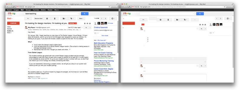
See? It’s still a bunch of white with some gray squares.
So, get a good copywriter, and let her do her thing.
Can’t do that right now? No problem, do it yourself:
How To Write Good Copy
Grabbing a magazine in a lazy Sunday afternoon with a cup of a tea means you’re going to spend some quality time with a magazine, reading IT and only IT. Not even a Facebook notification will distract you from IT, much less a burning house either.
This is not true for the web.
Most people that browse the web are simply looking for info, or answers. We don’t spend a lot of time (if any) on just one page. The average time someone spends on a page is just 8 seconds.The average time someone spends on a page is just 8 seconds.
Eight seconds. It’s an incredibly short amount of time. That’s why…
Content is king. It is hands down the most important aspect of your site.
The key is to reduce fluff and force content. The key is to limit choices and options in order to lessen confusion and doubt.
Sites should:
*Use short sections that cut to the chase
*Content should be written in plain English
*Paragraphs should be no longer than 4 sentences long
*The key takeaway is that you should use short snippets of text, and couple them with bulleted points when able.
I’d recommend using a font size of 18pt and generous leading.
Your intended users have specific wants and needs. Base your content around that. So:
*Find out who your site’s visitors are
*Analyse their wants and needs
*Write content that responds to the wants and needs
*Rewrite same content again, this time in words people can understand
*Structure the content so people can find it easily
Practice restraint with links. Do not overwhelm one paragraph with 98 links to other pages. Be deliberate, and choose your links carefully. Why? Because folks tend to hop from link to link until there’s nowhere else to hop to. We do it kind of subconsciously, believing there’s a hidden trail to get the critical info that we’re looking for. Besides, who hasn’t tried to read as much about something as possible? That happens when we scour and open every link on a page. So, keep them in check.
When labelling links, make them long enough to be clicked easily. And also use descriptive link labels so there are no surprises. Instead of writing a link like “Visit this website to read more about how to keep tooth enamel safe”, try writing “Learn 5 basic enamel safety tips anyone can do.”
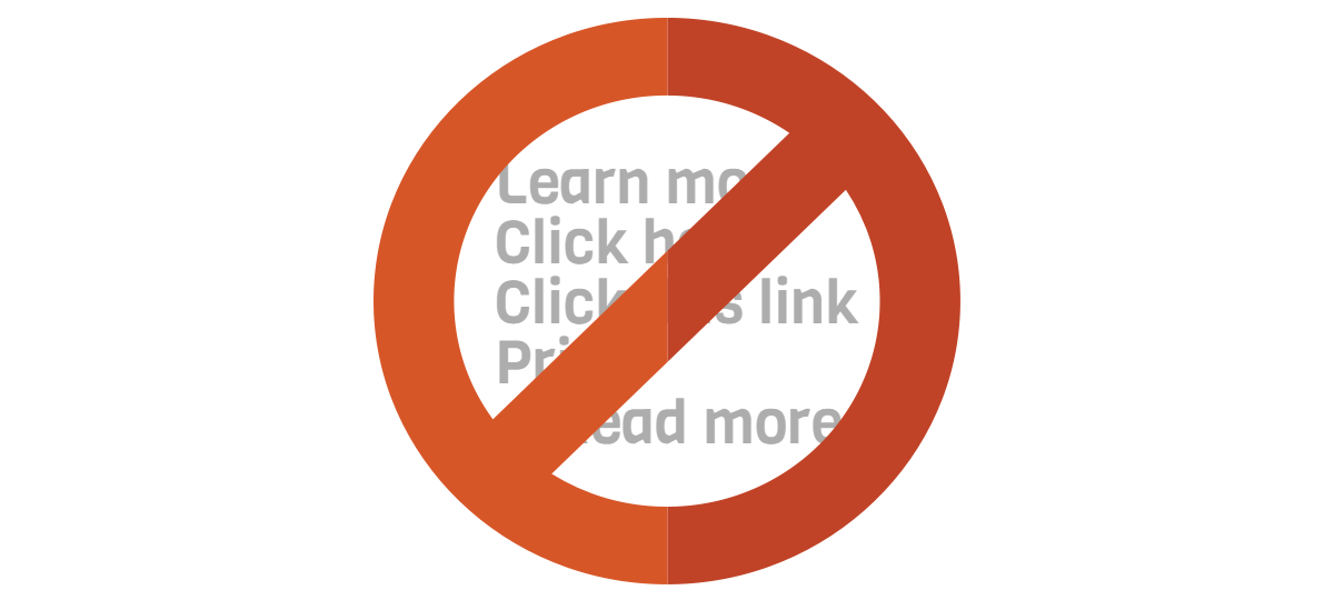
ABOVE ALL ELSE AVOID THESE TOXIC PITFALLS:
Learn more
Click here
Click this link
Print
Read more
See more
“something”+more
Under no circumstance should you use these words in link building. Ever. No excuses. People who don’t know how to use computers don’t need to be told to “click here” no matter what you think. And be as descriptive as possible. Avoid the slapping “Learn more” and calling it a day, because “Learn more” gives people no information about where they’re going to end up when they click the link.
Now that you’ve finished the content, take a break. Pour yourself a cup of tea; read the newspaper; go see your kids. Once you return, sit comfortably and brace yourself:
You have completed step 1.
What Makes A Website Look Good?
There’s no way to put it. It’s a mix of trends (remember gradients?) and personal opinion.
Right now Flat design is all the rage, coupled with diffused shadows.
Who knows what’s coming next.
But there are basics you can take care of that don’t depend on trends that much, like solid navigation and information architecture of your site.
Good navigation is simple, straightforward, and bodes no confusion. Drop down menus, buttons, or graphics may be overwhelming if used only as a masturbatory exercise. This means that they’re used solely to add fluff to the site, or to present your company’s values. Basically, any graphic element or image that does not contribute to better understanding of the topic at hand is useless, and most like a branding masturbatory exercise. Avoid this, profusely.
Base yourself in true basics: links.
Sites like daringfireball.net or zenhabits.net use links to great effect. Their navigation structure is simple, straightforward and non-obfuscated.
Beware of design for design’s sake. As Julie Zhuo, Product Design Director at Facebook put it, Good Design is “Simple and Obvious”:
“Obviousness comes from conforming to people’s existing mental models. Don’t waste time reinventing common UI patterns or paradigms unless they are at least 2x better, or you have some critical brand reason to do so.3. Look for opportunities to lean on familiar patterns or mental models. If you are designing an editing interface, don’t make the user flip between an “edit” mode with a bunch of input boxes and a “published” mode for display. As in the real world, editing should feel as close to direct manipulation as possible so users don’t have to perform a translation of these different models in their heads.”
Platforms change over time — just compare the original iPhone with the newest model. Or even better, compare Android 1.0 with the newest version. There are new interface mechanics being introduced, with new visual languages as well. Creating a website that stands the test of time is almost impossible.
You should always refresh your look from time to time, because you don’t want your site in 2016 to look like it’s from 2012.
But if you poured thousands of dollars into your site, how do you justify spending that amount so often?
You don’t.
Themes For WordPress Are Great
There’s a reason why millions of people choose to set up a website based on WordPress theme.
Themes Are Inexpensive
Custom built sites are exorbitantly expensive. Quotes vary by country, where the West sees figures ranging from 5000$ to even 50,000$.
A better solution would be to buy a premium quality theme for WordPress.
The best part is that such finely crafted themes are now within reach for anyone. They’re cost-effective, to use the corporate term, and are a true example of the 20/80 rule. In the long run, they’re cheaper to maintain, especially considering that a custom site would require custom support which again means thousands of dollars being paid to a web studio.
Themes Can Be Customised
Almost all custom themes have flexible designs. This means you can mould them to your heart’s and your organisation’s content. You can do much of the “heavy lifting” yourself, because the heavy in that lifting isn’t heavy at all. If you really need any outrageously custom pieces, you could hire a web designer to do it for you quickly. Even that option is cheaper than a full custom site.
Responsive; Mobile Friendly
Google is now unforgiving towards sites that don’t have a mobile version. They’ll put your result much lower in the list than before. And if you care about conversions, you also care about search result placement.
The beauty in WordPress and themes from, for example Themes Kingdom, is that they adapt great for any screen size, including smartphones!
Conversions = Design + Copy
Let’s recap:
You need two great things for your website to work. Make it look good (design) and be useful (copy).
Mix crystal clear content and svelte design. Stir, don’t shake. You’ll get a cocktail that’ll have a paramount impact on improving the way people experience your site and get vital info.
Shameless plug: Check out Themes Kingdom’s collection of premium WordPress themes for businesses, artists, photographers, chefs, wedding planners and much more.
Want to learn more?
We’ve written a ton of guides over at Themes Kingdom to help you out with a brand new website. Go check them out!
The author is highly qualified and writes blog posts weekly.

